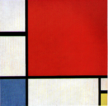
A composition with Red, Yellow and Blue
1922
After this artwork, people didn't just discover the world of Modern Art but they started using in an entertaining manner in 1920s! And people are still using it in interior design and most importantly in FASHION DESIGN!
YSL spring/summer collection 1996. The contrast of 3 primary colours and the black lines are giving a super attractive look and a great amount of energy. There couldn't even be any stronger inspiration than that.
Here we go starting to play with the colours and conrast in order to have a variety and find different types of attraction through Mondrianism. Oh man
From my perspective, this is not a "ready-to-wear" dress, this is wearing an artwork. This is how you develop a business for an artist like Piet Mondrian. A revelutionist of Modern Art.
Mondrianism effect on shoe industry, I can see myself changing my walk while on these platforms..I can see how the contrast of colours can change my direction.
My analysis of Mondrian's worldwide famous artwork was that : He chose three very different colours, and I relate those colors to different types of human psychology, they are all very different, people are very different, people are associated with different things but there are always these black lines that makes come up together, maybe its the way how we are all born the same way..or maybe something else..I think even in 1922 people were really concerned about different psychologies and different characters, well I want to believe that they had other interests rather than gaining more land and attacking people.
All in all, Thank You Piet !


No comments:
Post a Comment